Naturally Inspired.
Helping Butterball speak to a more concious consumer.
Creating a brand that feels as good as it tastes.
The Ask:
As the cultural conversation shifted toward simpler ingredients and less processed options, Butterball saw an opportunity to introduce a new sub-brand rooted in transparency, quality, and tradition.
Our Approach:
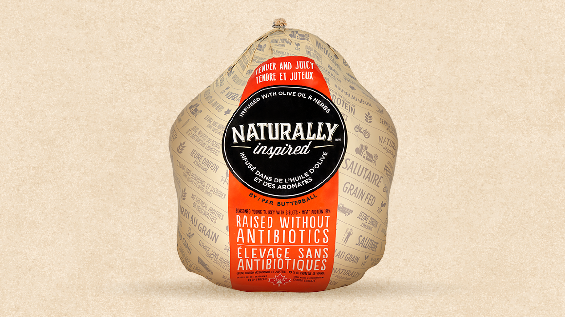
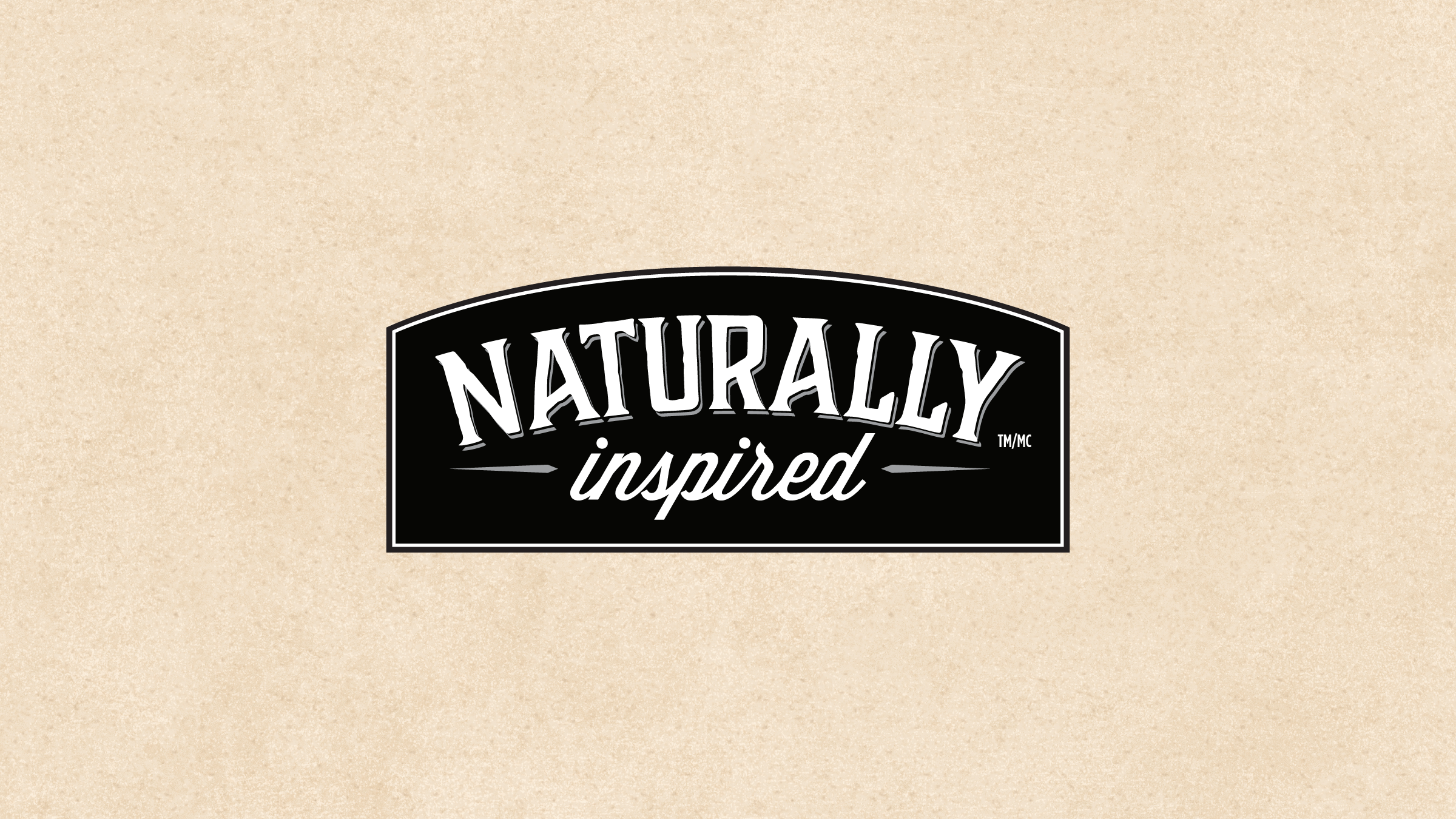
We began with a strategic naming exercise, ultimately landing on “Naturally Inspired.” The name strikes a balance between heritage and modern sensibility. From there, we crafted a wordmark that leans into tradition with subtle cues from vintage signage and hand-lettering.
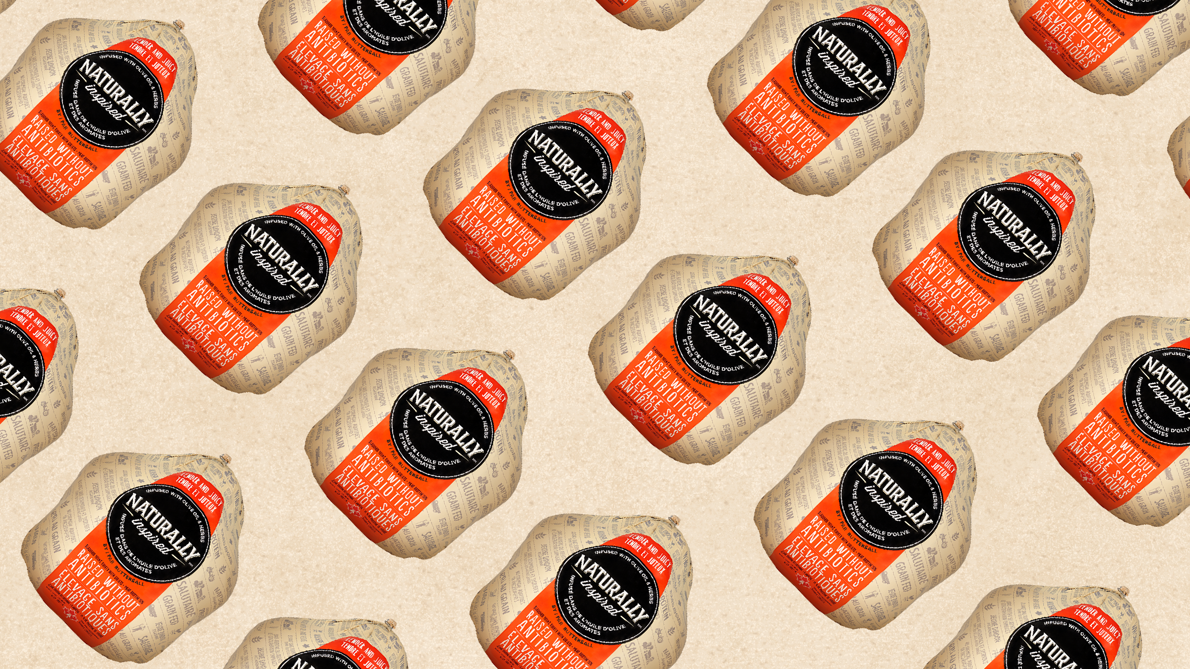
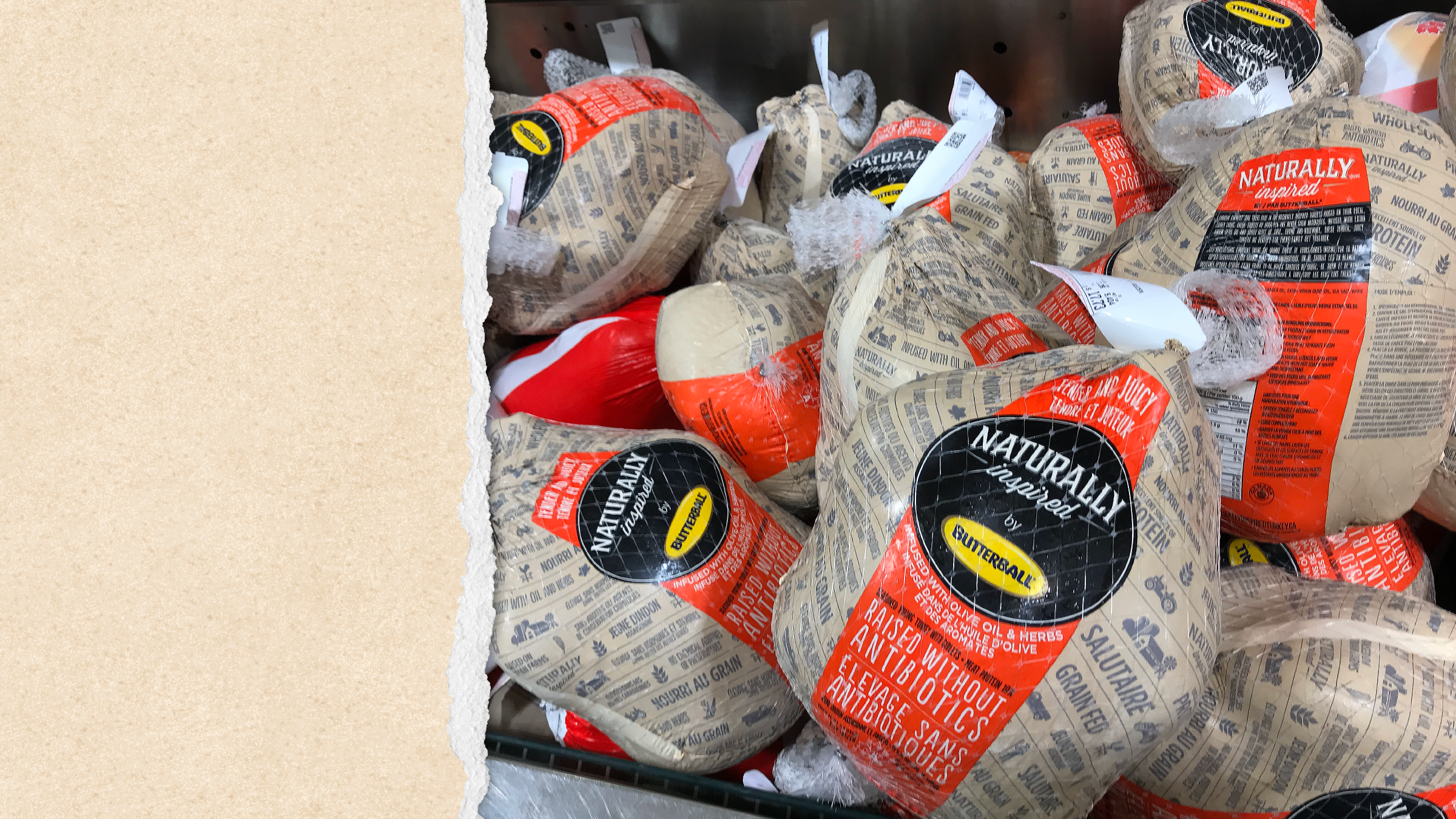
The packaging system reinforces this sense of craft and care. A kraft paper texture adds warmth and immediacy, evoking the feel of a local butcher’s wrap—simple, honest, and intentional. To create impact on shelf, we introduced a bold orange graphic element that cuts through clutter. This shape serves double duty—anchoring key product information while acting as a central visual beacon for the line. The color not only draws the eye but also cues vitality and natural ingredients, reinforcing the sub-brand’s positioning.
The Result:
The final design system balances history with modernity. It feels grounded, trustworthy, and intentionally humble—while the confident use of colour and typography adds a contemporary edge.
Deliverables:
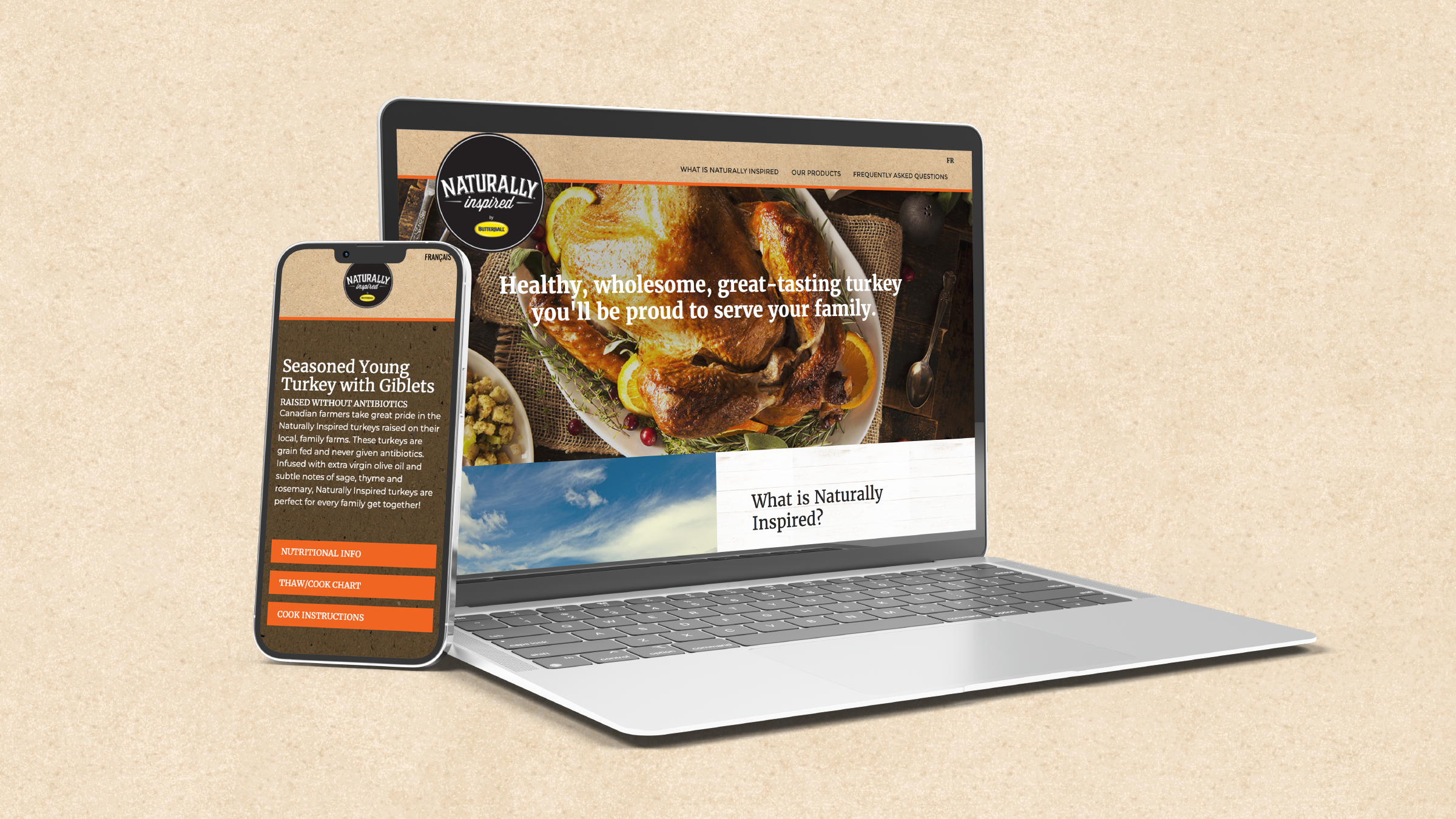
Naming / Logo / Package design / Web site